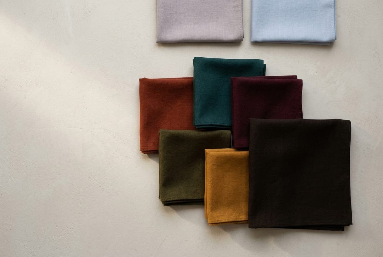
Deep Autumn is warm and deep at the same time, which makes it the bridge into Winter. It carries genuine darkness, real saturation and the richest end of the earth palette. Depth is the headline; warmth is the direction.
The Deep Autumn page covers identification. This is the wardrobe.
You get a near-black, and it changes everything
Of the three Autumns, this is the one that can wear something very close to black — a deep coffee brown, almost black, that keeps its warmth in daylight but reads as black across a room.
That single fact makes Deep Autumn much easier to dress than the other two, because the whole shop is full of dark neutrals and you can use most of them. Espresso, bitter chocolate, the darkest olive, a deep warm charcoal-brown.
What you do not want is true jet black in the top half. It is close enough to work that people default to it, and it is just cold enough to flatten the warmth in your face. The difference between jet black and a very dark warm brown is small on a hanger and obvious under your chin.
The colours
This is the richest palette in the system: deep rust, burnt brick, mahogany, wine, oxblood, forest, deep olive, dark teal, and ochre as the one bright note.
The key is saturation with depth. A Deep Autumn colour should look like it has been reduced rather than diluted — concentrated, not pale. A dusty version of the same colour goes flat, and a pastel version disappears entirely.
Deep teal and forest green are the two that do the most work, because both function as neutrals in a wardrobe while still being colours.
The swaps
| Instead of | Reach for | What changes |
|---|---|---|
| Jet black knit | Near-black coffee brown | Reads as black, keeps your warmth |
| Optic white shirt | Warm cream, ecru | Removes the harsh edge under the chin |
| Pale icy blue | Deep teal | The same coolness, at your depth |
| Dusty pink | Oxblood, wine | Depth instead of haze |
| Light grey | Dark olive, deep taupe | Stops the grey draining the face |
| Silver | Gold, bronze, copper | Warm metal against warm skin |
What to avoid, and why
Pale anything. This is the defining Deep Autumn problem and it is different from the other Autumns. Pastels, powder blue, pale lilac and washed-out neutrals do not merely fail to flatter — they vanish against your depth and make the whole outfit look unfinished. If a colour looks like it has had water added, it is not yours.
Cool greys. Especially the light and mid ones. They sit at the wrong temperature and the wrong depth simultaneously.
Optic white. Warm cream instead, every time.
Jet black next to the face. Not a disaster, and you will get away with it more than a True Autumn would. But the near-black brown is straightforwardly better and no harder to buy.
Where it goes wrong at the edges
Deep Autumn sits between True Autumn and Deep Winter, and both confusions are common.
Against True Autumn, the question is depth: if the darkest, richest versions suit you better than the mid-strength golden ones, you are Deep. Against Deep Winter, the question is warmth: hold a warm mahogany against a cool burgundy in daylight. Deep Autumn takes the mahogany; Deep Winter takes the burgundy.
If that test is too close to call, the free quiz settles the parent season, and DUPI reads the sub-season from a photograph and shows you what it finds at real prices.