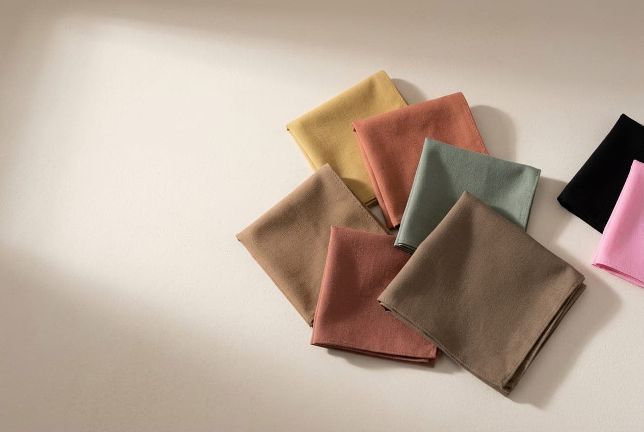
Soft Autumn is warm and muted, and it is the Autumn that bridges toward Summer. The colouring is blended and low in contrast — golden, but gently so — and the palette that suits it is dusty rather than rich.
The Soft Autumn page covers whether you are one. This is the wardrobe that follows.
Contrast is the thing to manage, not colour
Most colour advice is about hue. For a Soft Autumn, the more useful variable is contrast — how far apart the lightest and darkest things in your outfit are.
Your colouring is low contrast: hair, skin and eyes sit close together in depth. An outfit built on a big gap — a white shirt under a dark jacket — puts more contrast on your body than there is in your face, and the outfit wins. You end up looking like an accessory to your own clothes.
The fix is not to wear less colour. It is to keep the pieces close together in depth. A caramel jumper with warm sand trousers has almost no contrast and looks considered. The same jumper with black trousers does not.
This single adjustment does more for a Soft Autumn than any individual colour choice.
The neutrals
Your anchor is a warm mid-taupe brown — not dark, not light, and slightly greyed. It is an unglamorous colour on a hanger and an extremely useful one on a person.
Around it: warm cream, oatmeal, soft camel, mushroom, a greyed olive. These read as boring in isolation and work beautifully together, which is the whole character of this palette.
There is no true black here and no true white. Both are too far from where your colouring sits.
The colours
Muted and warm: sage, soft moss, dusty terracotta, caramel, rosewood, gold-olive, muted teal, and a soft brick.
The test for whether a colour belongs is whether it looks like it has a little grey mixed into it. A clean, clear version of the same colour will look like it is sitting on top of you. A slightly dusty version settles.
Soft Autumn is also the one Autumn that can borrow from Soft Summer at the cool edge — a muted teal or a greyed sage works from either side of the border.
The swaps
| Instead of | Reach for | What changes |
|---|---|---|
| Black | Warm taupe, greyed olive | Removes the contrast that overwhelms your face |
| Optic white | Warm cream, oatmeal | Softens the top of the outfit |
| Bright coral or hot pink | Rosewood, dusty terracotta | Colour without the shouting |
| Icy pastels | Sage, muted sand | Warmth instead of chill |
| Clear emerald | Muted teal, soft moss | The same idea, at your chroma |
| High-shine silver | Bronze, soft gold, rose gold | Warm metal, kept matte |
What to avoid, and why
Black. More than for the other Autumns. It is both too dark and too clean for a blended, low-contrast face, and it is the single most common reason a Soft Autumn looks tired in photographs.
Stark white. Same problem from the other direction. Warm cream does everything you need.
Bright, clean colours. Hot pink, clear emerald, vivid orange. These are not too warm or too cool — they are too clear. Clarity is what overpowers this type.
High shine. Polished metal, patent leather, satin with a hard sheen. Matte and brushed finishes suit the softness of the colouring; a hard shine introduces contrast in a different form.
The mistake that looks like a virtue
Soft Autumns are often complimented on looking understated, and then over-correct into a wardrobe of beige that has no colour in it at all.
Muted does not mean absent. The palette has real colours in it — rosewood, sage, terracotta — they are simply softened. An outfit of nothing but oatmeal is not a Soft Autumn outfit; it is an unfinished one.
The neighbours
True Autumn shares your warmth at full strength — if saturated rust suits you rather than overwhelming you, that is the likelier read. Soft Summer shares your muting but runs cool; hold a warm caramel against a cool mauve in daylight and see which one settles.
If it is genuinely close, the free quiz confirms the parent season, and DUPI places the sub-season from one photograph and finds pieces in that palette at prices that are actually listed.