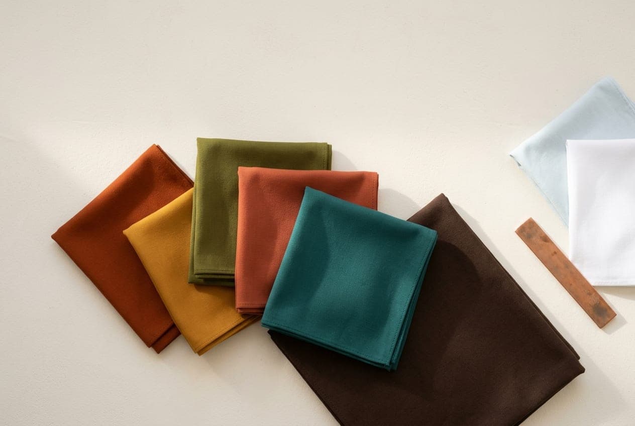
True Autumn is the hue-led Autumn: warmth is the headline, not depth and not softness. The colouring carries genuine golden warmth, and the palette that suits it is fresh, sunlit and properly saturated.
The True Autumn page covers whether you are one. This is what to do about it.
Your problem is probably volume, not colour
Most True Autumns already own warm colours. What they do not do is wear them at full strength.
The word Autumn suggests something muted and cosy, so people reach for beige, oatmeal and soft camel and then wonder why they look slightly washed out. That is Soft Autumn territory. True Autumn is the one that takes rust, ochre and moss at their real saturation and looks underdressed without them.
If you have been told you look tired in a wardrobe of neutrals, this is usually why. The fix is not a different neutral. It is putting an actual colour next to your face.
The neutrals
Your anchor is a warm mid-brown — golden coffee, tan, chestnut. This does the job black does for other people: it grounds an outfit, it goes with everything in the palette, and it reads as finished.
Beyond that: camel, warm sand, olive worn as a neutral, and cream in place of white.
A warm, lighter navy is wearable. A cold inky navy is not — it belongs to Winter and it puts a chill under a golden face.
The colours
Rust, terracotta, brick, warm red, ochre, mustard, golden yellow, moss, olive, forest, and a deep warm teal that behaves like a neutral once you own it.
Teal is the one to reach for when you want something that does not read as obviously autumnal. It sits properly in the palette but everyone else sees it as a cool colour, which makes it useful in settings where rust would feel like a statement.
The swaps
| Instead of | Reach for | What changes |
|---|---|---|
| Black | Golden coffee, chestnut | Grounds the outfit without cooling the face |
| Optic white | Cream, warm ivory | Stops the skin reading sallow |
| Cool grey | Warm sand, olive | Removes the greying effect |
| Icy or dusty pastels | Warm apricot, soft moss | Keeps clarity and warmth together |
| Cool pink and fuchsia | Brick, warm coral, rust | Reds that settle rather than turn the skin pink |
| Silver | Gold, copper, bronze | The metal stops fighting the skin |
What to avoid, and why
Black next to the face. True Autumn has warmth but not the depth Deep Autumn has, so black does not just cool the face — it outweighs it. Below the waist it is close to harmless.
Optic white. The blue-white of a technical shirt. Cream is the direct replacement and nobody will notice the swap except in a good way.
Greyed pastels. Dusty lilac, powder blue, soft mauve. These are Summer colours. On a True Autumn they read as faded rather than soft.
Cool grey. The most common offender because grey is sold as neutral. It is not neutral on warm colouring; it visibly greys the skin. Warm sand or a light olive does the same job.
Metals and the small stuff
Gold, copper and bronze. Silver reads cold and slightly lifeless against this colouring, and the difference is more visible than most people expect — it is worth testing a gold and a silver chain side by side in daylight once, because the result usually settles the question permanently.
The same logic applies to hardware on bags and shoes, and to the frames of glasses, which sit closer to your face than any garment.
Where True Autumn is easy to get wrong
The two neighbours are worth knowing. Soft Autumn shares the warmth but wants everything greyed down; if full-strength rust feels loud on you, that is the likelier read. Deep Autumn shares the warmth but goes darker and richer, and can carry near-black where you cannot.
If you are between them, the free quiz confirms the parent season, and DUPI places the sub-season from a photograph — then finds pieces in that palette at prices that are actually listed.