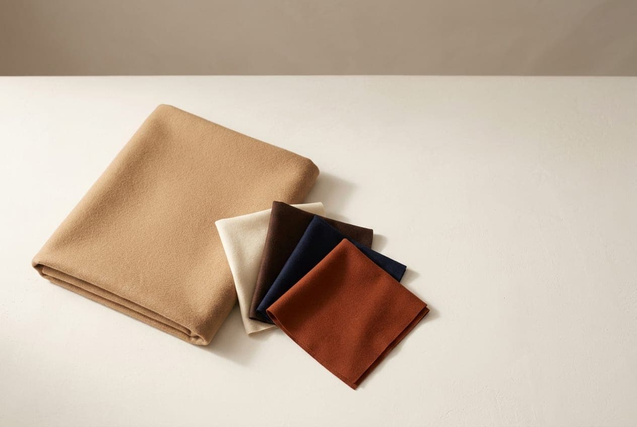
A camel coat is one of the few garments that reliably makes everything underneath look more considered. It is also easy to get slightly wrong, because camel is a warm mid-tone and it interacts with whatever it is worn over.
The three combinations that always work
Camel over cream or ivory. Tonal, warm and quiet. The most expensive-looking thing you can do with a camel coat, and the easiest — two warm neutrals a few shades apart, with no contrast to manage.
Camel over grey. The most modern of the three. Warm over cool sounds like it should not work and does, because the grey stops the camel from reading as beige. Mid-grey is better than charcoal.
Camel over chocolate or espresso. Deep warm brown under a lighter warm brown. Rich, tonal and considerably less obvious than camel over black.
What to be careful with
Camel over black. Not wrong, and extremely common, but it is the combination that makes camel look flat. Black is cool and absolute; camel is warm and soft. The contrast is high enough to make the coat look like a beige rectangle rather than a colour.
If you want it, break it up with something warm at the neck — a cream scarf, a camel or rust knit — so the eye has somewhere to go.
Camel over camel, slightly off. Two warm neutrals that are close but not the same read as an attempt to match that has failed. Either match properly or leave several shades between them.
Camel with anything cold and pale. Icy blue, cold pink and optic white all fight it. Warm white and cream do not.
Colours that lift it
If you want the coat to be a backdrop rather than the whole outfit, camel takes strong colour well:
- Forest green and olive — the best of the lot, and very British
- Burgundy and oxblood — warm, deep, autumnal
- Rust and terracotta — tonal warmth, quite bold
- Navy — cooler, sharper, more formal than the others
- Emerald — high contrast, works better than you expect
Avoid neon and very cold brights; they sit on top of the coat rather than with it.
Does camel suit you
This is the honest question, and the answer is not universal.
Camel is a warm mid-tone, so it sits most naturally on Spring and Autumn colouring, where it functions as a genuine neutral. Autumn in particular can treat it as a core wardrobe colour.
Cool seasons can find camel drains them, especially close to the face. Two fixes that work: buy the coat in a cooler, greyer camel, or keep a scarf in one of your own colours between the coat and your face. Both are more practical than avoiding a coat colour this useful.
Summer usually does better in a stone or taupe version, Winter in camel that leans toward a deep tan rather than golden.
The free quiz will tell you which half of that you are in.
Buying one
Camel is a colour where fabric quality shows immediately, because there is nowhere for a cheap fibre to hide — the colour is flat and light, so texture and drape carry it entirely.
Check the composition before the price. A wool blend above about 50% will look and hang noticeably better than a mostly-synthetic version of the same shape. Reading a composition label covers the rest.